My friend and lifelong writer bud Lee Burton was kind enough to help me make a plan recently to get my writing out into the world and maybe make a little money at it.
One of the items in ACTION PLAN.docx (the document which outlines the plan in question) is to create an author website. Which, if you’re reading this, you’ve already found, so hey! Welcome!
I’m not really a good hand for visuals, so I usually have a hard time figuring out what I want to do with a new website like this. I decided I’d take a survey of the sites put up by some of the authors whose work I’ve enjoyed over the years, and see what I could infer from them.
Ugly On Purpose
Let’s start with a couple of sites that aren’t formatted for visual appeal.
Charlie Stross is a writer of deep, complex, even mind-bending fiction. He’s also a veteran of multiple tech startups. His author website is spartan.

Greg Egan takes this idea to an entirely new level. His website is nearly as unforgiving as his novel-length fiction. And I love it. Egan might be my all-time favourite author, so obviously I’m biased, but…Just Look At It.

Minimalist
Kieron Gillen‘s site surprised me. It’s not quite ugly on purpose, but it certainly isn’t trying to show off the comic writer’s frankly astonishing catalogue of achievements in the field of sequential art. Sure, he’s a writer. No argument from me. But I was surprised all the same.
John Scalzi has an interesting balance with his landing page. This has evolved over the years, and John’s page has always been first and foremost a blog, but this large header image with the highlight of him and his daughter, Athena – now co-blogger on Whatever – is visually appealing but doesn’t speak to the writing itself. When you’ve had the career John has, that makes a kind of sense.

N.K. Jemisin’s site is an almost perfect distillation of minimalism for an author. Not surprising, really – her work feels like this, and for me, at least, this page tells me the thing I want to know: I’ve found her site, and there’s stuff to look at. I love the neon-ish outline here, and of course we could all wish for a pull quote like that.

Marketing-Lead
These authors are getting the job done with nice, if utilitarian, sites that tell you what they’re doing first and foremost.
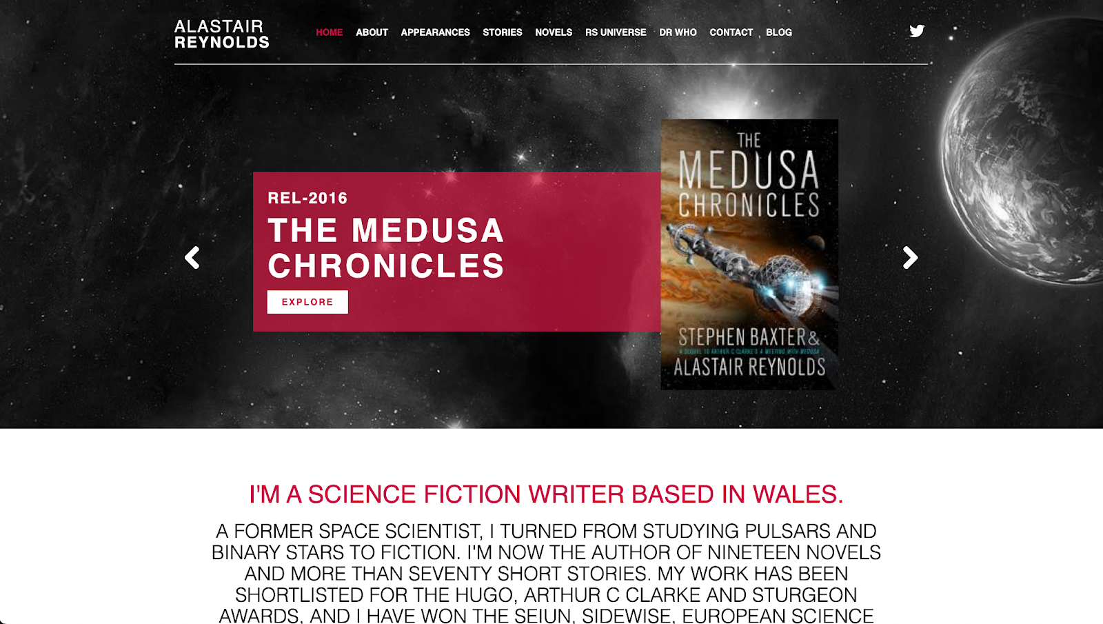
Alistair Reynolds’ landing page, on the other hand, is a study in impact. You’ve got a background image that evokes Reynolds’ work, a carousel in the foreground so you can scroll through his recent work, a statement of identity at the bottom, and a spare but complete menu at the top that blends well with the banner.
Having said all that, there’s something that feels slightly off about this page, but as I said before, I’m not a visual person, so I couldn’t put my finger on it. It could just be the all-caps at the bottom, but whatever it is, it reminds me that even a really good site won’t be to everyone’s taste.
I haven’t read Jim C. Hines’ fiction (yet), but I absolutely adore his industry posts. His front page is, in keeping with that, extremely tight and focused on what matters – the work that folks might want to purchase. Again here we see a little personality, with the cartoon header that fits together nicely with the covers below.

Personality-Forward
Some authors establish an identity for themselves and it shows. I’ve collected a few examples
Patrick Rothfuss has a site that has his face on it not once but twice, and the layout feels like a page from one of his books. It’s not a heavily designed site, which makes sense to me given how much of Rothfuss’s time and energy is put into worthy charitable causes, but you know who you’re dealing with and what to expect all the same.

If you don’t already know Cat Valente‘s work, you can get a really good feel for it just by visiting her website. Cat is the author of the Fairyland series, among many other works, and her landing page makes you feel a bit like circumnavigating a fantasy world all on your own.

Charlie Jane Anders has a site that just immediately feels fun in a way that few professional pages could. She carries this look over into some of the subpages on the site, which is a +++bonus points lesson for all of us aspiring authors out there.

Mary Robinette Kowal has a brilliant example of blending the feeling of her work with the necessities of marketing. The banner image here tells you precisely what you need to know about her books, with their exacting depiction of space and their hopeful flights of imagination. And right up front we have that same Here Is My Work presence that gives Reynolds’ site impact. A new reader immediately has a place to start with her fiction.
A small sour note here is that the text gets cut off, but at first glance you don’t even notice.

Brandon Sanderson
Brandon Sanderson is, to my mind, one of the true 800-pound gorillas of the modern genre field. He’s prolific, well-regarded, and he’s done a fantastic job in building the business end of his work into an engine worthy of his reputation with readers.
No surprise, then, that his website is an object lesson in online presence. I love how the main blocks fit neatly into frame at default resolution. As an older, and thus habitually-zoomed-in (125%) web user, this isn’t quite as clean for me as it could be, but I can certainly forgive that – even the gnarliest accessibility UX designers I know struggle to create views that are this clean, let alone accommodate my aging eyes in the bargain.
The progress bars are the grace note here, though. Only someone like Sanderson – who famously wrote nearly a dozen books before he sold one – might dare to tell people not only how many projects he’s juggling but where he is in each one. Even Stephen King doesn’t poke the hornet’s nest quite this much.

One comment on “Author Websites: A Survey of Sorts”